Chart Du Jour
By Tim Iacono
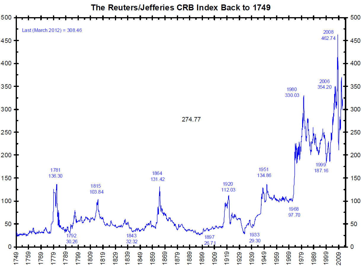
It ‘s not clear how graphics like the one below (spotted at The Big Picture)
are created since there probably wasn’t a Bloomberg-like organization
to collect data for the price of sugar back in the 1700s, but, if the
data is anywhere near accurate, it tells a fascinating story – not about
commodities, but about the U.S. dollar.
Of course, history will be the judge of the current era of pure fiat
money. My guess is that, at some point in the not-too-distant future,
the curve above will steepen rather sharply, the monetary system as we
know it will get its RESET button pushed, and we’ll revert to something other than pure fiat money.
About The Author - Tim Iacono, a retired software engineer living in Bozeman, Montana, is the founder of Iacono Research. (EconMatters author archive here.)
