Chart In Focus

June 20, 2013
Editor, The McClellan Market Report McClellan Financial

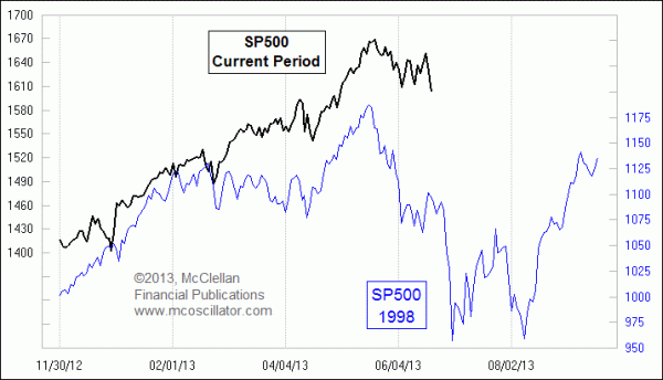
If the 1998 price pattern analog is correct, there is more damage yet to come for the stock market in 2013.
Price pattern analogs are a fun way to model what might happen to prices in the future. The operating theory behind them is that a similar set of market conditions in one period and another results in the same rules of physics affecting price movements. But whenever I bring up any comparison between different market periods, someone will inevitably point out that the relevant market factors are different in terms of interest rates, fed policy, valuations, etc. My response is that maybe those are not the factors which matter.
Back in 1998, the stock market went through one of the quickest 20% declines in history. It took just over a month to get all wrapped up, plus another 6 weeks to put in a retest low.
The initial selling in July 1998 was thought at the time to be just some "summer doldrums" type of action, but in the background there were liquidity problems developing in overseas markets which started to degrade liquidity in the U.S. stock market. There had also been a big A-D Line divergence from earlier that year.
Then on August 4, 1998, famed technical analyst Ralph Acampora was interviewed on CNBC and revealed a "major sell signal" which sparked a 3.6% one-day drop in the SP500. For a long time, Acampora was blamed for "causing" the ensuing sharp selloff, but that's like blaming the lookout on the Titanic for causing the iceberg to be there. He just recognized what was happening, and the illiquidity conditions that were causing it.
We don't have a big A-D Line divergence in 2013, but we do have signs of illiquidity nonetheless. Bond CEFs were telling us about liquidity problems back in April, well ahead of the May 21, 2013 closing high. And more recently, emerging markets stocks have been showing a lot of weakness. These groups are among the most liquidity sensitive market issues, acting like the canaries in the coal mine which would keel over from bad gases before the big burly coal miners were affected.
Whenever I look at a price pattern analog like the one pictured above, I like to find multiple points of similarity leading up to something like a major top or bottom. The two price plots are aligned based on the big price tops in the center of the chart, but looking back before the top we can see that many of the minor dance steps leading up to it were present in each pattern. It is not a perfect match, and it never is with these analogs, but it is pretty darned good. One notable point of similarity is that the turbulence we saw in April 2013, which was magnified by the Boston Marathon bombing, matches up nicely with a similar dip at the same point in the 1998 price pattern.
The implication is that if this pattern similarity continues into the future, then we are not done yet with the whole process of taking the market lower. The whole pause in the decline as we waited for some sort of new magical announcement from the FOMC on June 19 was the equivalent of the halfway measuring flag structure that the SP500 built in the summer of 1998. Soon we'll see the rest of the downward thrust, ultimately culminating in a bottom in August 2013, if the 1998 pattern is correct. My own expectation, based on a current analysis of the eurodollar COT leading indication, is that the final bottom should be more like September 2013 than August.
One point to note for whenever one contemplates such analogs is that eventually they all break correlation, and the patterns go their separate ways. Often that correlation break point comes at the moment when one is most counting on it to continue working, so caution and watching are always in order. And sometimes the breakup in correlation starts out with an inversion from the prior pattern, which then disinverts as they dance together again before breaking up altogether. These comparisons should never be trusted completely, but that's true for any tool or indicator.
Still, they are really fun to see when they do appear.
Tom McClellanPrice pattern analogs are a fun way to model what might happen to prices in the future. The operating theory behind them is that a similar set of market conditions in one period and another results in the same rules of physics affecting price movements. But whenever I bring up any comparison between different market periods, someone will inevitably point out that the relevant market factors are different in terms of interest rates, fed policy, valuations, etc. My response is that maybe those are not the factors which matter.
Back in 1998, the stock market went through one of the quickest 20% declines in history. It took just over a month to get all wrapped up, plus another 6 weeks to put in a retest low.
The initial selling in July 1998 was thought at the time to be just some "summer doldrums" type of action, but in the background there were liquidity problems developing in overseas markets which started to degrade liquidity in the U.S. stock market. There had also been a big A-D Line divergence from earlier that year.
Then on August 4, 1998, famed technical analyst Ralph Acampora was interviewed on CNBC and revealed a "major sell signal" which sparked a 3.6% one-day drop in the SP500. For a long time, Acampora was blamed for "causing" the ensuing sharp selloff, but that's like blaming the lookout on the Titanic for causing the iceberg to be there. He just recognized what was happening, and the illiquidity conditions that were causing it.
We don't have a big A-D Line divergence in 2013, but we do have signs of illiquidity nonetheless. Bond CEFs were telling us about liquidity problems back in April, well ahead of the May 21, 2013 closing high. And more recently, emerging markets stocks have been showing a lot of weakness. These groups are among the most liquidity sensitive market issues, acting like the canaries in the coal mine which would keel over from bad gases before the big burly coal miners were affected.
Whenever I look at a price pattern analog like the one pictured above, I like to find multiple points of similarity leading up to something like a major top or bottom. The two price plots are aligned based on the big price tops in the center of the chart, but looking back before the top we can see that many of the minor dance steps leading up to it were present in each pattern. It is not a perfect match, and it never is with these analogs, but it is pretty darned good. One notable point of similarity is that the turbulence we saw in April 2013, which was magnified by the Boston Marathon bombing, matches up nicely with a similar dip at the same point in the 1998 price pattern.
The implication is that if this pattern similarity continues into the future, then we are not done yet with the whole process of taking the market lower. The whole pause in the decline as we waited for some sort of new magical announcement from the FOMC on June 19 was the equivalent of the halfway measuring flag structure that the SP500 built in the summer of 1998. Soon we'll see the rest of the downward thrust, ultimately culminating in a bottom in August 2013, if the 1998 pattern is correct. My own expectation, based on a current analysis of the eurodollar COT leading indication, is that the final bottom should be more like September 2013 than August.
One point to note for whenever one contemplates such analogs is that eventually they all break correlation, and the patterns go their separate ways. Often that correlation break point comes at the moment when one is most counting on it to continue working, so caution and watching are always in order. And sometimes the breakup in correlation starts out with an inversion from the prior pattern, which then disinverts as they dance together again before breaking up altogether. These comparisons should never be trusted completely, but that's true for any tool or indicator.
Still, they are really fun to see when they do appear.
Editor, The McClellan Market Report McClellan Financial